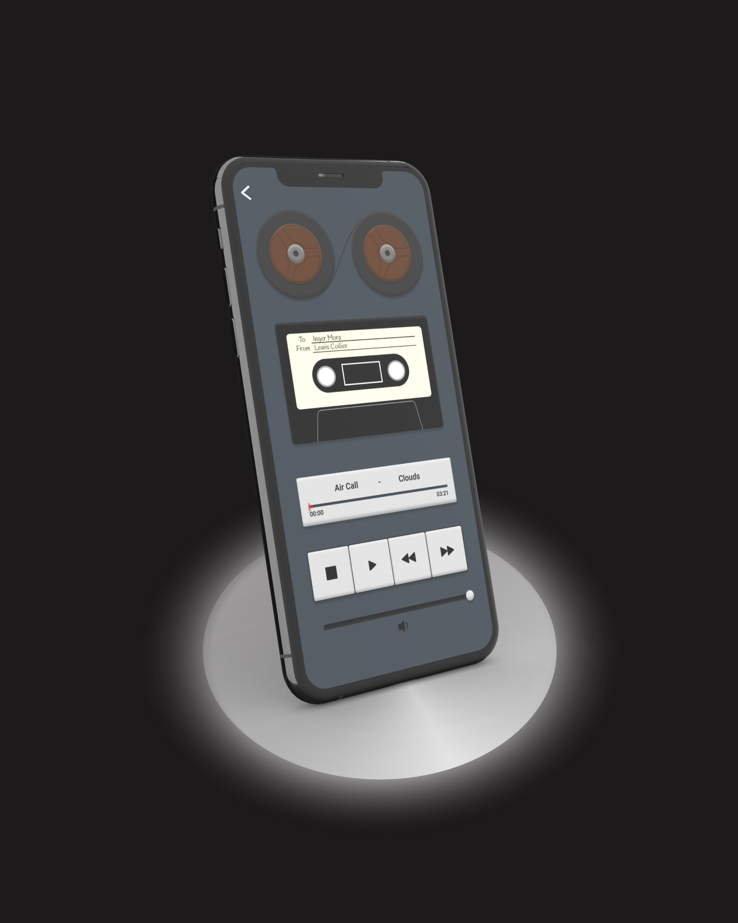

This project was made as a part of the course Interaction Design methods at KTH Royal Institute of Technology. It was done during a 10-week period of time and was centered around the improvement of an existing music application based on a specific user group.
I was part of a team of four students with equal responsibilty on how the project would realize. I was very much involved in every step of the process and gained a lot of experience in every step of the design process.
We followed a user-centered design process to figure out how the system could be better aligned with user goals, becom more pleasureable to use and harness the power of its medium better.
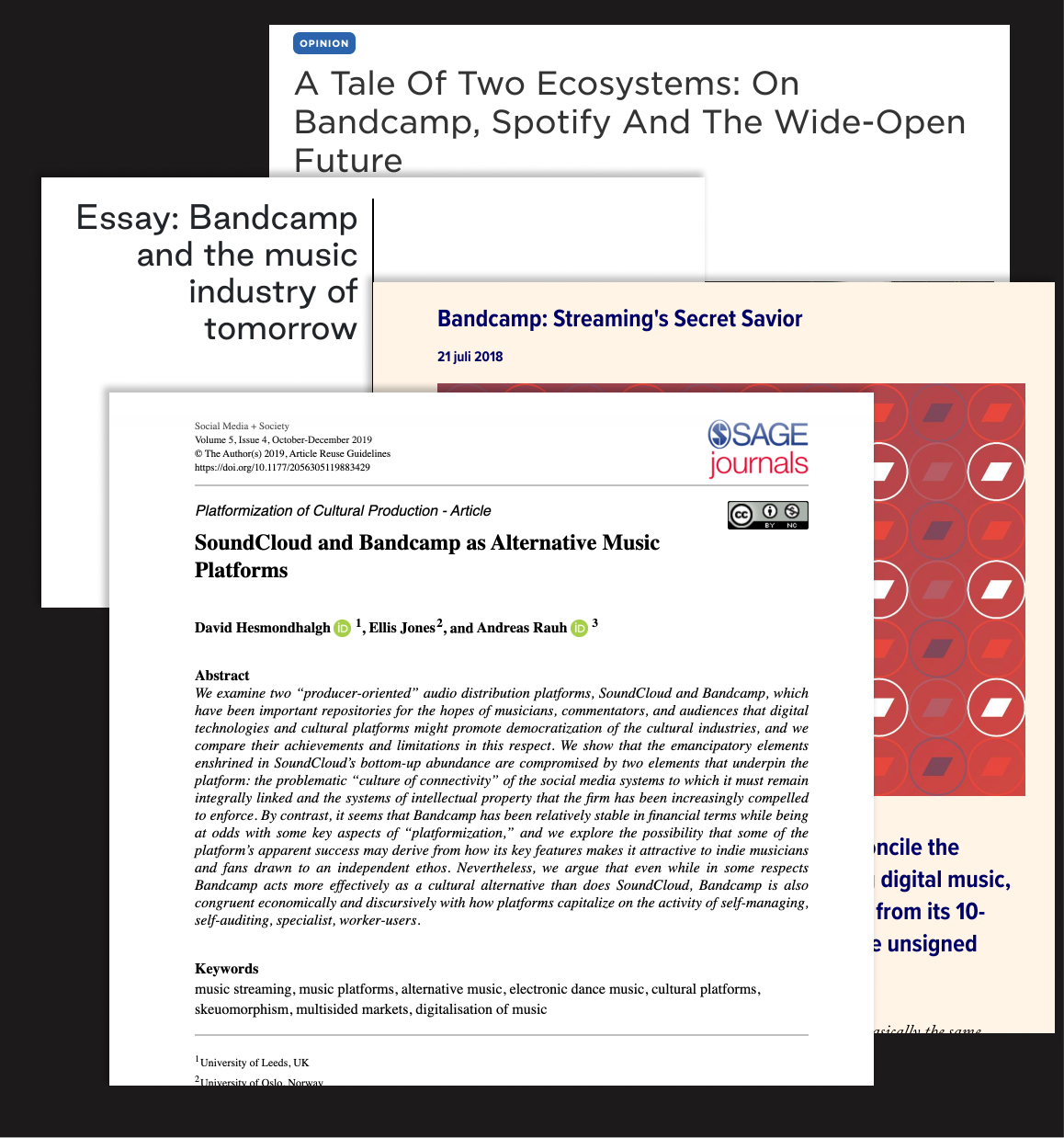
We conducted user and market research to drive our planning phase. This helped us find key insights that defined our path moving forward.
When researching Bandcamp we found that young people doesn’t use Bandcamp that much. This made us want to focus on Generation Z as a user group.
We also found that Bandcamp users rarely discover any music on the platform. Instead, they find music elsewere and purchases the music from Bandcamp.
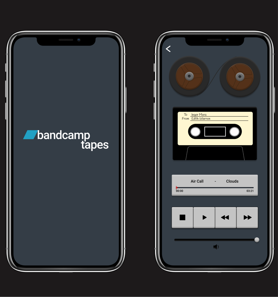
We were able to merge two ideas from two different methods into one feature.
How might we emulate the feeling of getting a tape from a friend?
+
Sending out physical tapes to users with music recommendations.
=
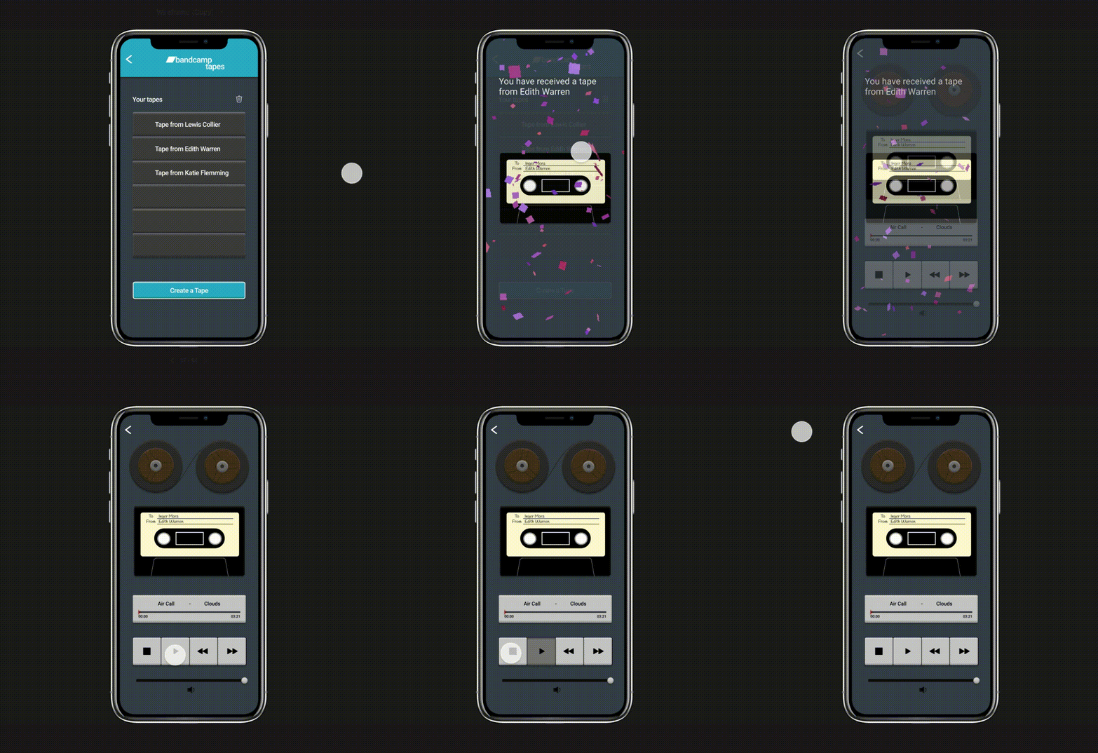
A feature where you can send and receive tapes digitally.
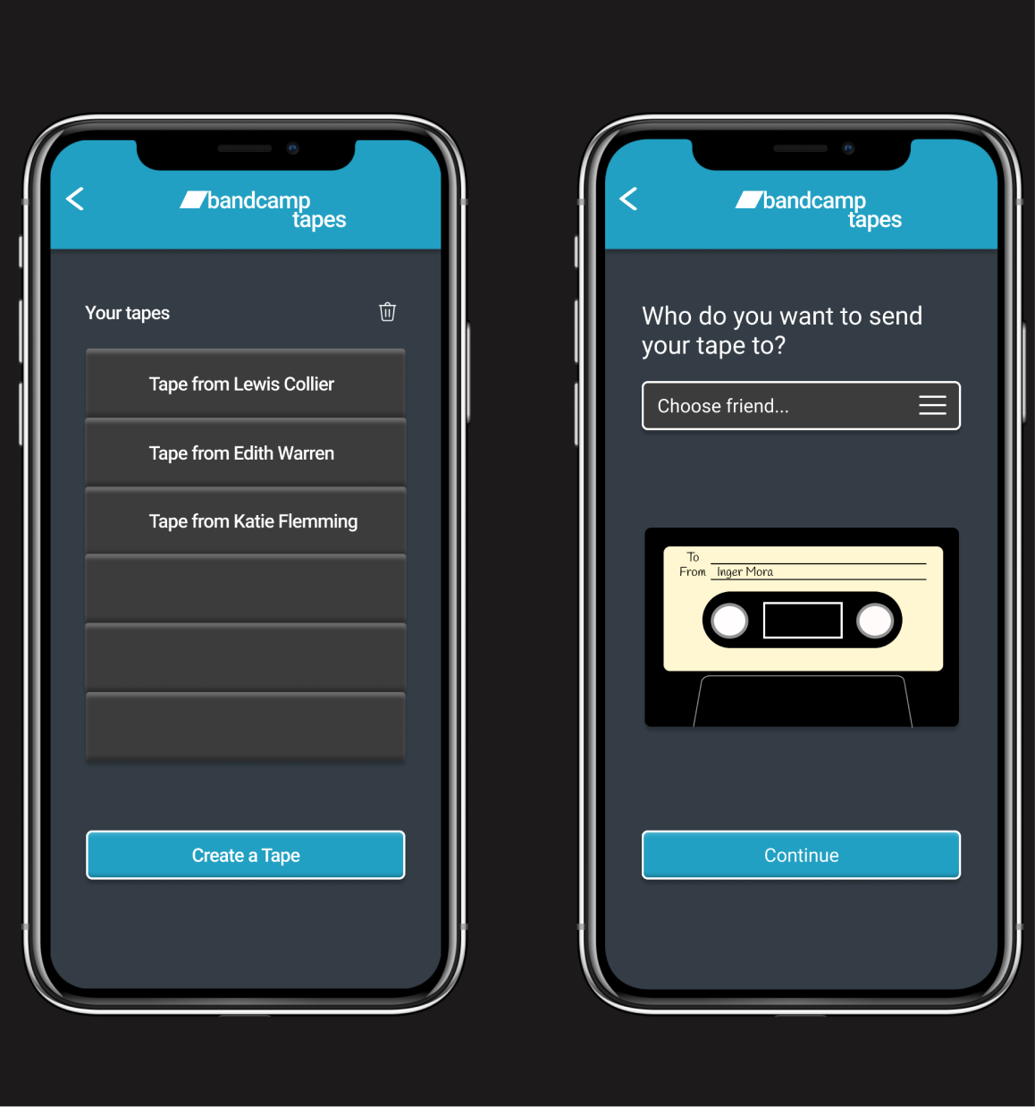
This was a very educative design process. However, everything rarely goes as planned and flexibility in regards to the design process was needed. Some important takeaways from the project were; the importance of using predecided methods, crafting a design that aligns with a company’s values, realizing that design isn't an optimization problem and using interactivity as a destination rather than only as a means to an end.